Let’s raise the curtain and reveal a new chapter in the history of Birrificio del Ducato: the restyling of our logo! The change will happen gradually and will lead to a new era for the most awarded Italian craft brewery in the world.
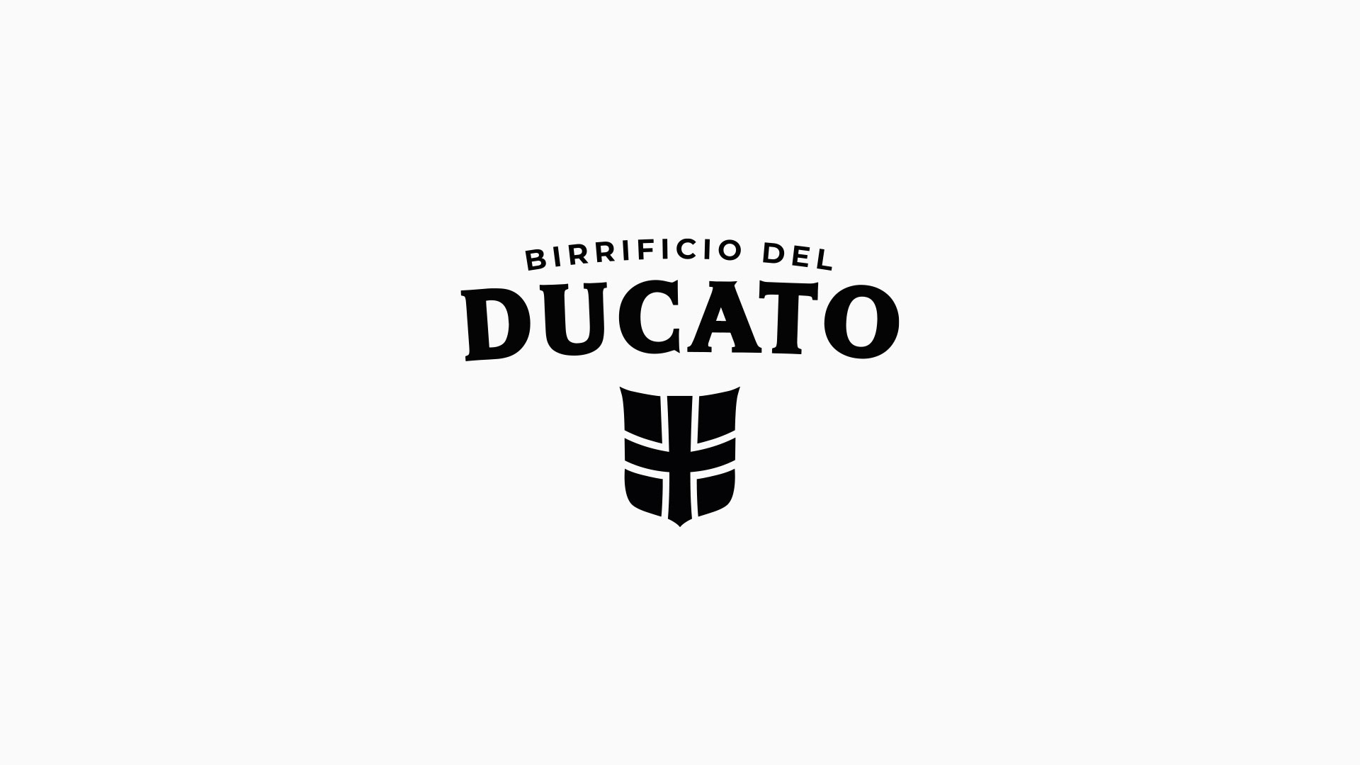
The new logo represents the essence of the brewery: the stylized shield of the Dukedom of Parma in the shape of a chalice with an emphasis on the word DUCATO.
Nothing transcending or too distant from the original logo, which felt outdated and was unable to reflect the updates, modernization and evolution that Birrificio del Ducato went through in recent years. More and more advanced production systems, new laboratory technologies and a modus operandi continuously focused on the quality of the beers are the key factors that pushed us to make this change. Our communication and marketing must simply represent the exceptional quality found in the bottles of Birrificio del Ducato.
The new logo is made up of 3 fundamental components:
– the Birrificio del Ducato name has been positioned above the shield and no longer around it, making it more visible and readable. The word DUCATO has been highlighted thanks to a resizing of the new typographic font, which is also more contemporary and representative of our current reality.
– Our pictogram, the shield, has remained practically intact because it represents our history, the symbol and emblem with which our brand has been recognized for 14 years in the world of craft breweries. The shield is the fundamental element that provides continuity with the old logo.
– The black and white color change has finally been completed. White represents purity, black represents elegance, both fundamental characteristics of each of our beers.
The result is a more modern, flexible and incisive logo, able to adapt to modern times and in line with the identity of the beerlovers’ community that has appreciated the quality of our beers throughout our years of activity.
 after
after before


